Minimalist architecture is experiencing a renaissance that looks nothing like its previous incarnation. The minimalism of the 1990s and early 2000s—all white walls, stark emptiness, and an asceticism that confused discomfort with sophistication—has given way to something warmer, more textured, and fundamentally more liveable. The new minimalism does not demand that you own fewer things or live in a space that resembles a gallery installation. It asks instead a more interesting question: what happens when every element in a building earns its place through beauty, function, or both, and nothing exists merely to fill space or signal wealth? The answer, as demonstrated by the most compelling architectural projects of the past five years, is spaces that are simultaneously serene and rich, simple in their overall composition but deeply considered in every material choice, joint detail, and proportional relationship.
This evolution reflects a broader cultural shift in how we understand luxury. The 20th-century equation—luxury equals more, bigger, shinier, more ornamented—has been progressively inverted by a generation that grew up in a world of material abundance and digital overwhelm. When everything is available instantly and cheaply, excess loses its power to impress. What becomes genuinely luxurious is restraint: the confidence to leave a wall bare because the quality of the plaster and the way light moves across it is sufficient; the discipline to choose one beautiful piece of furniture rather than filling a room with adequate ones; the architectural conviction that a window framing a specific view is more valuable than an entire wall of generic glass. Minimalist architecture, in its mature form, is not about having less. It is about having only what is excellent.
The Material Revolution: When Surfaces Tell Stories

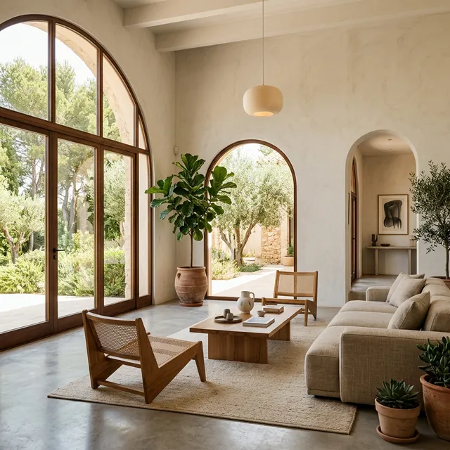
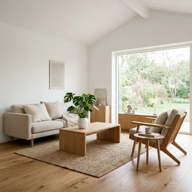
The most significant departure from earlier minimalism is the treatment of materials. First-generation minimalist interiors defaulted to white—white walls, white ceilings, white furniture—because white is the visual equivalent of silence: it eliminates the "noise" of colour and pattern, allowing spatial relationships and proportions to dominate the visual experience. The problem with wall-to-wall white is that it flattens the sensory environment to a single dimension. A white room has no texture to touch, no grain to study, no patina to develop over time. It is visually pure but experientially sterile.
Contemporary minimalist architecture uses materials that are visually quiet but sensorially rich. Raw concrete (béton brut)—left unfinished to display the formwork marks, aggregate texture, and subtle colour variations that occur naturally during the curing process—provides surfaces that are simultaneously austere and complex, their appearance shifting throughout the day as light angles change and shadows move across their textured faces. Timber—particularly wide-plank oak, ash, or walnut with minimal finishing that allows the wood grain, knots, and natural colour variation to remain visible—introduces warmth, organic pattern, and a tactile quality that invites touch in a way that painted surfaces never do. Natural stone—limestone, travertine, terrazzo with visible aggregate, honed granite—brings geological history into the room, each slab carrying millions of years of sedimentation, pressure, and mineralogical accident in its surface pattern.
The Japanese concept of wabi-sabi—finding beauty in imperfection, impermanence, and incompleteness—has become the philosophical anchor of this material approach. A concrete wall with visible pour lines and minor surface variations is not a construction defect; it is evidence of the material's process, a documentation of the moment of its making. A timber floor that develops scratches and patina over years of use is not deteriorating; it is accumulating the physical record of life lived upon it. This philosophical framework liberates minimalism from the tyranny of perfection that made earlier iterations feel cold and intimidating: the new minimalism accommodates life rather than demanding that life conform to its aesthetic standards.
Light as the Primary Design Element
In minimalist architecture, where decorative elements are deliberately minimised, light assumes the role that ornamentation plays in more traditional design: it creates visual interest, establishes mood, articulates spatial boundaries, and transforms a room's character over the course of a day. The most sophisticated minimalist buildings are essentially instruments for modulating natural light—their window placements, wall angles, and ceiling geometries designed to capture, direct, and diffuse sunlight in ways that produce continuously changing interior environments.
Tadao Ando—the self-taught Japanese architect who is arguably the most influential living practitioner of minimalist design—builds almost exclusively with concrete, water, and light. His Church of the Light in Osaka is the canonical example: a concrete box with a cruciform slot cut into the altar wall, through which daylight projects a cross of light onto the interior floor. The cross moves and changes throughout the day, and the entire spatial experience transforms from intimate and meditative in overcast conditions to dramatic and electrifying when direct sunlight hits the slot. The building contains virtually nothing—concrete walls, wooden pews, a concrete floor—and yet it produces an emotional and spiritual experience that more elaborately decorated religious buildings rarely achieve.
In residential applications, the principle translates through strategic window design. A single, carefully positioned window—proportioned to frame a specific view, oriented to capture morning light or afternoon sunlight, recessed into a thick wall that creates a deep reveal with its own shadow geometry—can define a room's character more effectively than any combination of furniture, art, and decoration. Floor-to-ceiling windows along a single wall, combined with a deep ceiling plane that acts as a light shelf to bounce indirect illumination deep into the room's interior, create spaces that feel open and connected to the outdoors while maintaining the sense of shelter and enclosure that makes a house feel like a home rather than a fishbowl.
The Indian Context: Minimalism Meets Climate
Applying minimalist architectural principles in India produces distinctive results because India's climate, cultural context, and living patterns create design constraints and opportunities that European or Japanese minimalism does not address. The Indian minimalist must contend with: extreme heat (designing for thermal comfort without excessive energy consumption), monsoon rainfall (waterproofing and drainage considerations that temperate climates don't face), dust (materials and surfaces that are practical to maintain in dusty environments), multi-generational household structures (spaces that accommodate joint families while providing individual privacy), and domestic help (the presence of household staff in many Indian homes creates spatial requirements—separate working kitchens, service entries, utility areas—that Western minimalist floor plans typically omit).
The firm Studio Mumbai, led by Bijoy Jain, exemplifies how minimalist principles adapt to Indian conditions. Their projects use locally sourced materials—stone from Rajasthan quarries, timber from sustainably managed teak plantations, laterite blocks from the Konkan coast—worked by traditional craftsmen using hand tools and ancestral techniques. The resulting buildings are visually austere (simple volumes, unornamented surfaces, restrained colour palettes) but materially rich in a way that reflects Indian craft traditions: hand-chiselled stone surfaces with visible tool marks, timber joinery using traditional techniques without metal fasteners, terracotta tiles produced by local potters. These are buildings that could only be built in India—their materials, construction methods, and spatial organisation are inseparable from the specific cultural and geographic context of their creation.
Climate-responsive minimalism in India often employs traditional passive cooling strategies: deep verandahs that shade exterior walls from direct sun, internal courtyards that create natural convection cooling through the stack effect, jaali screens (perforated stone or concrete screens) that allow air movement while filtering harsh sunlight, and thick masonry walls with high thermal mass that absorb heat during the day and radiate it slowly at night. These elements—courtyards, jaalis, verandahs—are not decorative additions to the minimalist palette; they are functional components that solve specific climatic problems while creating spaces of remarkable spatial beauty.
Frequently Asked Questions (FAQs)
Is minimalist architecture actually practical for families with children?
Yes, but it requires a specific approach to storage and material selection. The common misconception is that minimalist spaces must be perpetually pristine—an impossible standard with children. Practically, minimalist family homes succeed through: abundant, well-designed concealed storage (built-in cabinets, under-stair storage, furniture with integrated storage) that provides a place for everything, making tidiness achievable rather than aspirational; durable, forgiving materials (engineered timber floors that tolerate spills, concrete surfaces that improve with age, leather upholstery that develops patina rather than showing damage); and a spatial philosophy that prioritises flexible, open-plan living areas where children can play, study, and socialise within sight of adults. The minimalist family home is not one where toys don't exist; it is one where toys have a designated home and the underlying architecture remains calm and coherent regardless of the daily level of domestic chaos.
How do you achieve minimalist design on a limited budget?
Minimalism is inherently budget-friendly when executed correctly, because it requires fewer elements and therefore fewer purchases. The critical budget allocation principle is: invest in surfaces (floors, walls, ceilings) and infrastructure (lighting, plumbing fixtures, kitchen counters) rather than moveable objects (furniture, art, accessories). A beautifully finished concrete or polished cement floor costs less than mid-range tile and produces a more architecturally coherent result. White or light-coloured lime-washed walls are cheaper than paint and develop a textured, organic quality that painted surfaces cannot replicate. Simple, well-proportioned furniture from local carpenters using solid wood costs comparable to mass-produced furniture and lasts decades longer. The expensive items in minimalist design are the ones you buy once and keep forever; the savings come from everything you don't buy because the design doesn't demand them.
What's the difference between minimalist architecture and simply having an empty, boring space?
The difference lies in intention, proportion, and material quality. An empty room with cheap materials, poor proportions, and random lighting is not minimalist—it is unfinished. A minimalist room is one where every element has been deliberately chosen and meticulously executed: the wall height, the window proportions, the material of the floor, the colour temperature of the lighting, the relationship between ceiling plane and wall plane. The absence of objects in a minimalist space is not a failure to fill the room; it is a deliberate decision to let the architecture itself—the quality of light, the texture of surfaces, the proportional relationships of the spatial enclosure—serve as the visual and experiential content. A well-designed minimalist room feels complete and satisfying despite containing very little, because the room itself is the design object.


Comments (0)
Be the first to share your thoughts on this article.